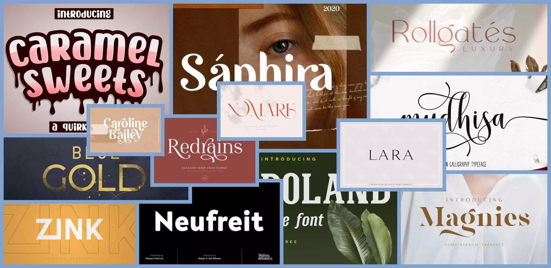
Death by Comic Sans? A Guide to Perfect PowerPoint Fonts
Okay, let's talk fonts. Because while a killer outfit can make you feel invincible, a killer PowerPoint presentation can make you feel… well, employed. And nothing screams "I made this at 2 AM" louder than a slide deck drowning in Comic Sans. So, how do we navigate the treacherous waters of typography and emerge with presentations that slay? We're diving deep into the art of choosing the perfect PowerPoint font.
Choosing the right typography for your presentations can feel like a minefield. Too fussy and it's distracting. Too plain and it's boring. But finding that Goldilocks font—just right—can elevate your entire presentation, making it more engaging, professional, and memorable. It's about more than just looking good; it's about communicating effectively.
The history of presentation fonts is… well, let’s just say it's evolved. From the clunky, pixelated fonts of early presentation software to the sleek, modern options we have today, the journey has been long and sometimes painful. Remember those default Times New Roman slides? Shudders. But as presentations became more sophisticated, so did the understanding of how typography impacts audience engagement.
The main issue with choosing fonts for presentations boils down to readability. You can have the most aesthetically pleasing font in the world, but if your audience can’t decipher it from the back row, what’s the point? It's a delicate balance between style and substance. A good PowerPoint font needs to be clear, concise, and captivating, all at the same time. Think of it as the perfect LBD of your presentation wardrobe – versatile, timeless, and always appropriate.
So what constitutes a "good" font? Generally, sans-serif fonts like Arial, Calibri, and Helvetica are considered easier to read on screens. Serif fonts, like Times New Roman and Georgia, are traditionally associated with printed materials and can sometimes feel a little heavy for presentations. But rules are made to be broken, right? A well-chosen serif font can add a touch of classic elegance, as long as it’s used strategically and at a large enough size.
One key benefit of picking the right font is improved readability. Imagine trying to read a dense paragraph in a script font – a total nightmare. A clear, easy-to-read font ensures your audience can absorb the information without straining their eyes. This is especially crucial for presentations with lots of text. Another benefit is enhanced professionalism. The right font conveys credibility and attention to detail. Finally, a well-chosen font can boost audience engagement, making your presentation more visually appealing and memorable.
Let's create a mini action plan: First, identify your target audience. A playful font might work for a creative presentation, but not so much for a corporate pitch. Next, consider the tone and content of your presentation. Finally, experiment with different font pairings. Try combining a bold sans-serif header with a lighter sans-serif body font for a clean, modern look.
Advantages and Disadvantages of Different Font Types
| Font Type | Advantages | Disadvantages |
|---|---|---|
| Sans-serif | Clean, modern, easy to read on screen | Can feel generic if overused |
| Serif | Classic, elegant, adds a touch of formality | Can be harder to read on screen at smaller sizes |
Best Practices:
1. Limit your font choices: Stick to two or three fonts maximum.
2. Use large font sizes: Ensure readability from the back of the room.
3. Consider contrast: Use dark text on a light background or vice versa.
4. Test your fonts: Project your slides to ensure they're legible.
5. Be consistent: Use the same fonts throughout your presentation.
Real Examples: Arial for body text, Helvetica for headings, Garamond for a classic touch, Futura for a modern feel, and Georgia for a slightly more formal look.
Challenges and Solutions: Dealing with limited font options on different devices? Embed your fonts within the presentation. Font rendering issues? Test your presentation on different operating systems. Font appearing too small? Increase the font size. Font looking cluttered? Increase line spacing.
FAQ: What's the best font size? At least 24pt for body text. Should I use decorative fonts? Sparingly. What are some good font pairings? Arial and Calibri, Helvetica and Garamond. How do I embed fonts? Check your presentation software's help section.
Tips & Tricks: Use bold and italics sparingly to emphasize key points. Avoid all caps - it can feel like shouting. Use consistent kerning and tracking for a polished look.
In conclusion, choosing the right PowerPoint font is crucial for creating impactful presentations. It's about more than just aesthetics; it's about effectively communicating your message. By following best practices, understanding the advantages and disadvantages of different font types, and considering your audience, you can select fonts that enhance readability, boost engagement, and elevate your entire presentation. Don't underestimate the power of good typography. It's the silent but powerful force behind a truly captivating presentation. So ditch the Comic Sans, embrace the world of typographic possibilities, and watch your presentations go from drab to fab. Your audience (and your career) will thank you.
Discovering normandy park washington
Unlocking value jacksonville free items
Effortless finances unlocking the power of surat buka akaun bank pekerja


