Death by PowerPoint? Nah, Just Pick the Right Font Size!
So, you've slaved over your PowerPoint presentation. The graphics are slick, the transitions are smooth, and you've even managed to inject some humor (hopefully). But then, disaster strikes. You project your slides, and the audience squints, groans, and whips out their magnifying glasses. What went wrong? Chances are, you botched the font size. It's a seemingly minor detail that can make or break your presentation. Don't let your hard work be undone by a typographical tragedy.
Finding the optimal PowerPoint font size isn't rocket science, but there's definitely more to it than picking a number at random. The right font size can transform your presentation from an eye-sore into a masterpiece of communication. Too small, and your audience will be straining to decipher your message. Too large, and your slides will look cluttered and amateurish. This isn't just about aesthetics; it’s about accessibility and ensuring your message actually reaches your audience. Let’s face it, nobody wants to endure a presentation that feels like a visit to the optometrist.
The issue of ideal font sizes for PowerPoint has been a silent killer of presentations since the software's inception. Remember those early PowerPoint days filled with dizzying transitions and, more importantly, microscopic text? Yeah, we've all been there. Thankfully, presentation design has come a long way, but font size remains a common stumbling block. While features and templates have evolved, the core principle of readability remains paramount. A well-chosen font size is essential for conveying information effectively and keeping your audience engaged.
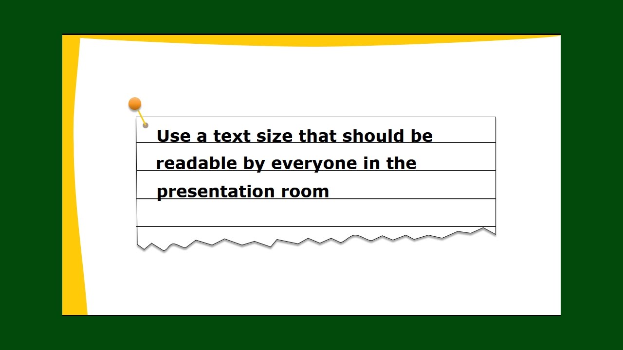
Why does this even matter? Because a presentation isn't about you; it's about your message and the audience receiving it. The perfect font size ensures everyone in the room – from the front row to the back – can comfortably read your slides. It’s a sign of respect for your audience's time and a testament to your professionalism. So, how do you choose the perfect font size? Keep reading. We're about to delve into the nitty-gritty of PowerPoint typography.
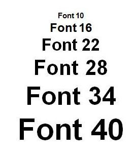
Let's start with the basics. For titles, aim for a minimum of 32 points. Body text should generally be no smaller than 24 points. These are just guidelines, of course, and the ideal sizes may vary depending on the font you choose, the size of the room, and the projector's resolution. But these recommendations offer a solid starting point. Experiment and see what looks best for your specific presentation. Don’t be afraid to go larger if needed – clarity is king.
Historically, presentations relied on smaller font sizes due to limitations in projector technology. As technology advanced, larger fonts became more practical, shifting the focus towards improved audience readability.
Benefits: 1. Improved readability. 2. Enhanced audience engagement. 3. Professional appearance.
Action Plan: 1. Choose a clear font. 2. Use large sizes for titles (36-44pt). 3. Use smaller sizes for body text (24-32pt).
Advantages and Disadvantages of Optimal Font Sizing
| Advantages | Disadvantages |
|---|---|
| Improved Readability | Potential for Fewer Words per Slide |
| Enhanced Audience Engagement | May Require More Slides |
Best Practices: 1. Choose clear fonts like Arial or Calibri. 2. Use consistent sizing throughout. 3. Test your presentation on a projector beforehand.
Real Examples: 1. A marketing presentation used 44pt titles and 28pt body text for optimal readability. 2. A scientific presentation used 36pt titles and 24pt body text, adjusting for complex charts.
Challenges and Solutions: 1. Small room with low resolution projector - increase font sizes. 2. Complex charts with lots of labels - use concise labels and larger font sizes.
FAQ:
1. What's the ideal font size for titles? Aim for at least 32 points.
2. What's the minimum font size for body text? Try not to go smaller than 24 points.
3. Which fonts are best for presentations? Clear, sans-serif fonts like Arial and Calibri.
4. Should I use the same font size for everything? No, vary sizes for titles, subtitles, and body text.
5. How do I test my font size? Project your presentation and view it from the back of the room.
6. What if my text is too small? Increase the font size.
7. What if my text is too large? Decrease the font size and consider using more slides.
8. How can I ensure my PowerPoint font sizes are optimal? Test, test, and test again!
Tips: Use high contrast between text and background. Avoid decorative fonts for body text.
In conclusion, getting the best font size for your PowerPoint presentation isn’t just a matter of aesthetics; it’s about effective communication. By following these guidelines and best practices, you can ensure that your message is clear, accessible, and engaging for your audience. Remember, your presentation is about conveying information, not testing your audience’s eyesight. A well-chosen font size makes your presentation professional and allows your audience to focus on the content, not deciphering tiny letters. Take the time to experiment and find the right balance for your specific needs. Your audience will thank you for it. Don't let a small font size ruin your big presentation. Choose wisely, and let your message shine.
Unlocking ancient wisdom a journey into traditional wellness
When does the moon rise in delhi tonight
Turning the tide how research is combating water pollution


