Decoding the World of Fonts: A Guide to Font Types and Their Names
Ever wonder why some text feels elegant, while others appear modern and clean? The secret lies in the art of typography, specifically in the diverse world of font types and their unique names. Choosing the right font can transform a simple message into a powerful statement, evoking specific emotions and shaping the reader's perception. This exploration into the realm of fonts will unravel the mysteries behind those names like Arial, Helvetica, and Times New Roman, empowering you to make informed typographic decisions.
From the earliest handwritten scripts to the digital fonts we use today, the evolution of typography is a fascinating journey. Fonts, also known as typefaces, are collections of characters designed with a unified stylistic approach. Each font family, like the well-known Arial, includes various weights (bold, italic, regular) and styles, providing a comprehensive toolkit for visual communication. Understanding the historical context of a typeface can provide valuable insight into its intended use and inherent characteristics.
The importance of font selection cannot be overstated. In a world saturated with visual information, the right font can make your message stand out. It contributes to readability, brand identity, and overall aesthetic appeal. Imagine a luxury brand using Comic Sans – the dissonance would be jarring. Conversely, a playful children's book wouldn't benefit from the formality of Times New Roman. This delicate balance underscores the need for carefully considered font choices.
One of the main issues surrounding font types and their names is licensing. While many free fonts are available, some professional typefaces require purchase and adherence to specific usage guidelines. Understanding these restrictions is crucial to avoid legal complications. Furthermore, the sheer number of available fonts can be overwhelming for beginners. Navigating this vast landscape requires understanding the basic classifications of font types.
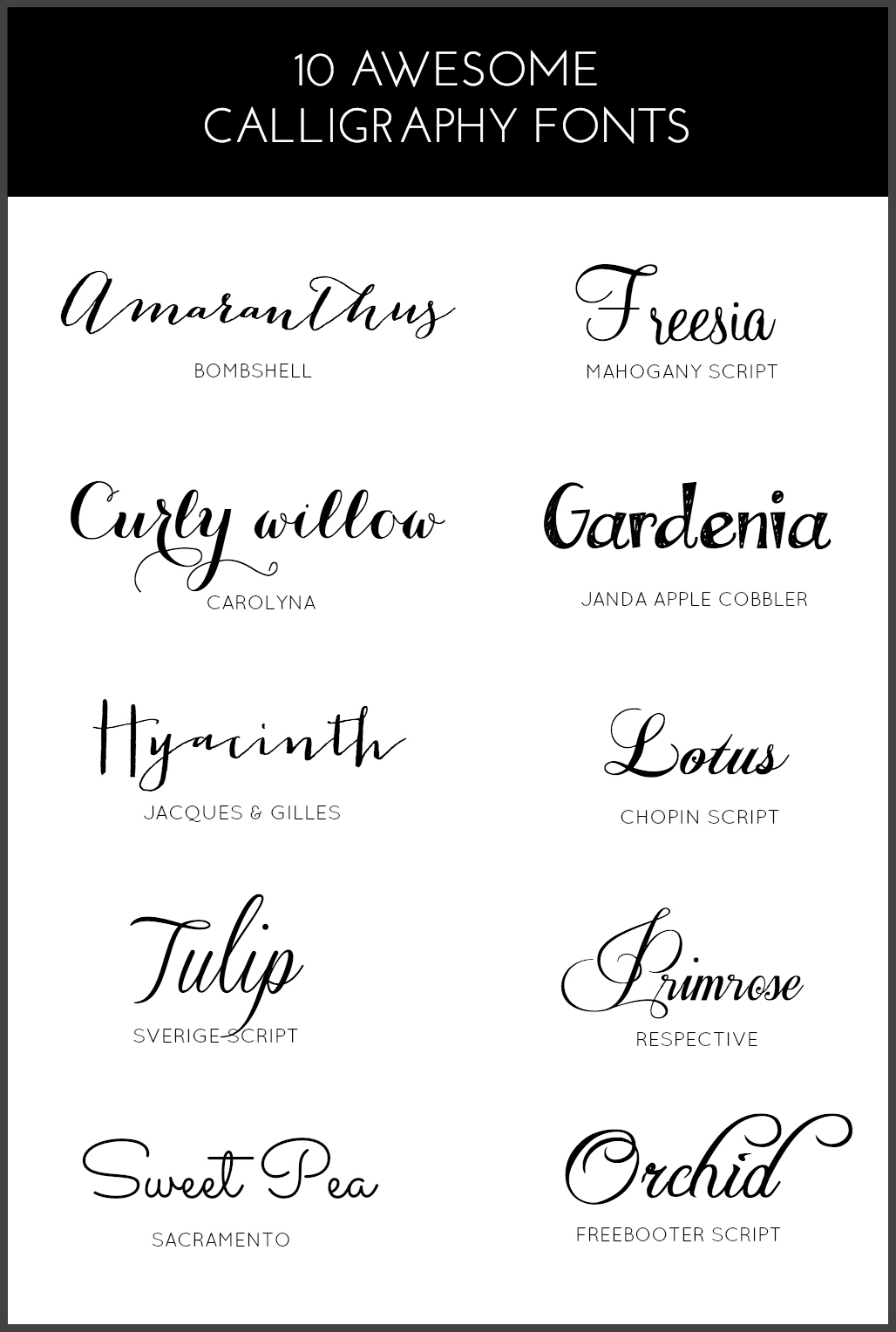
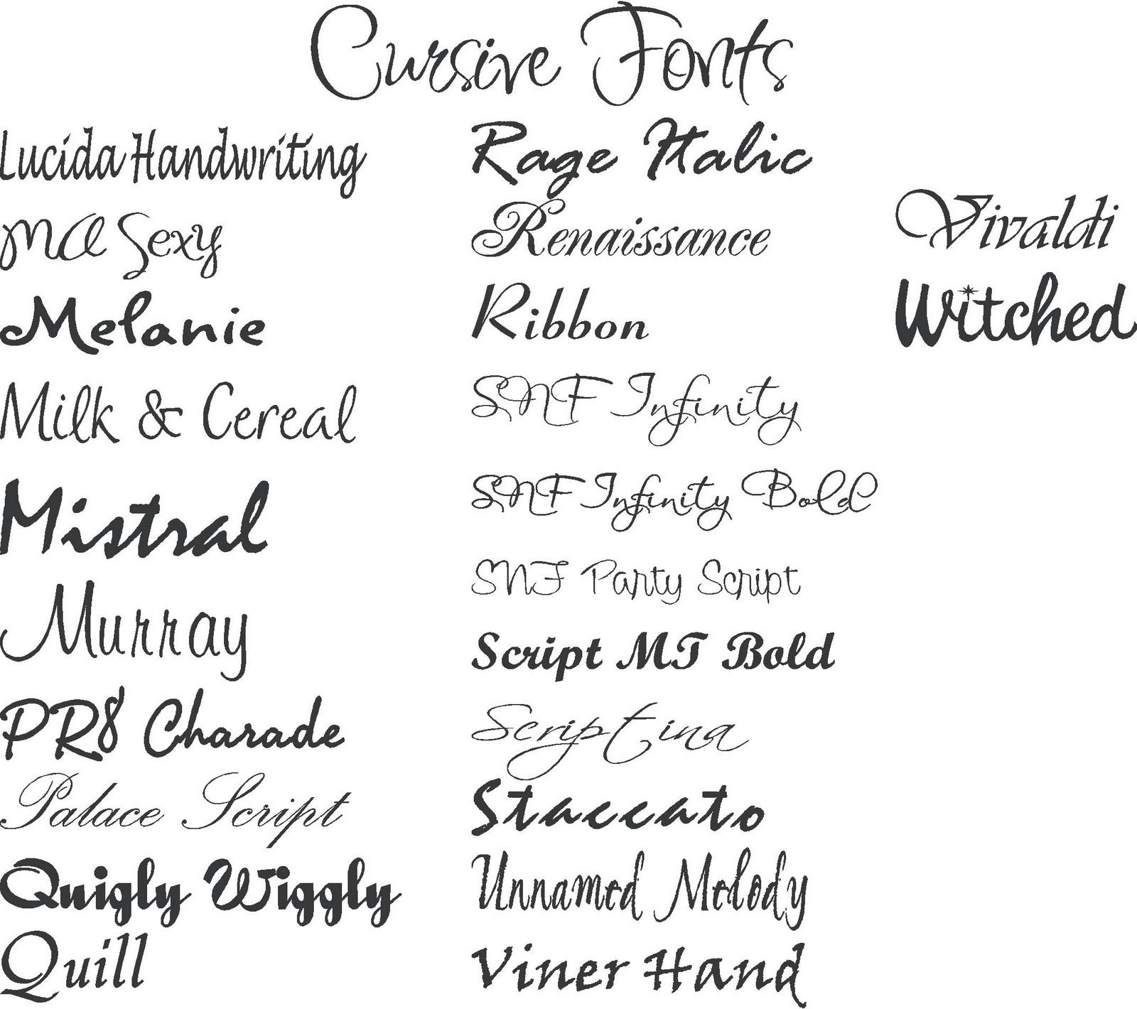
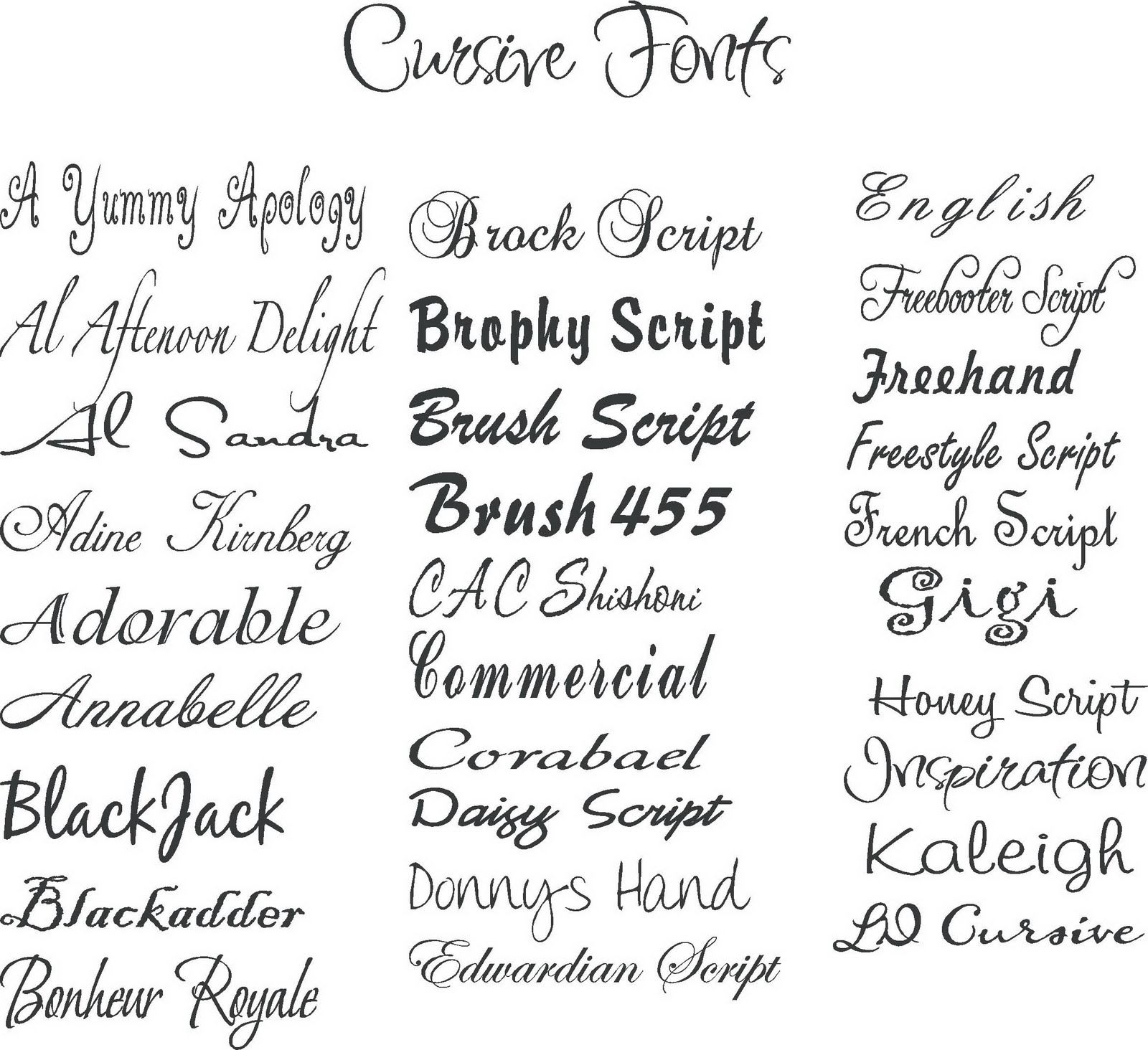
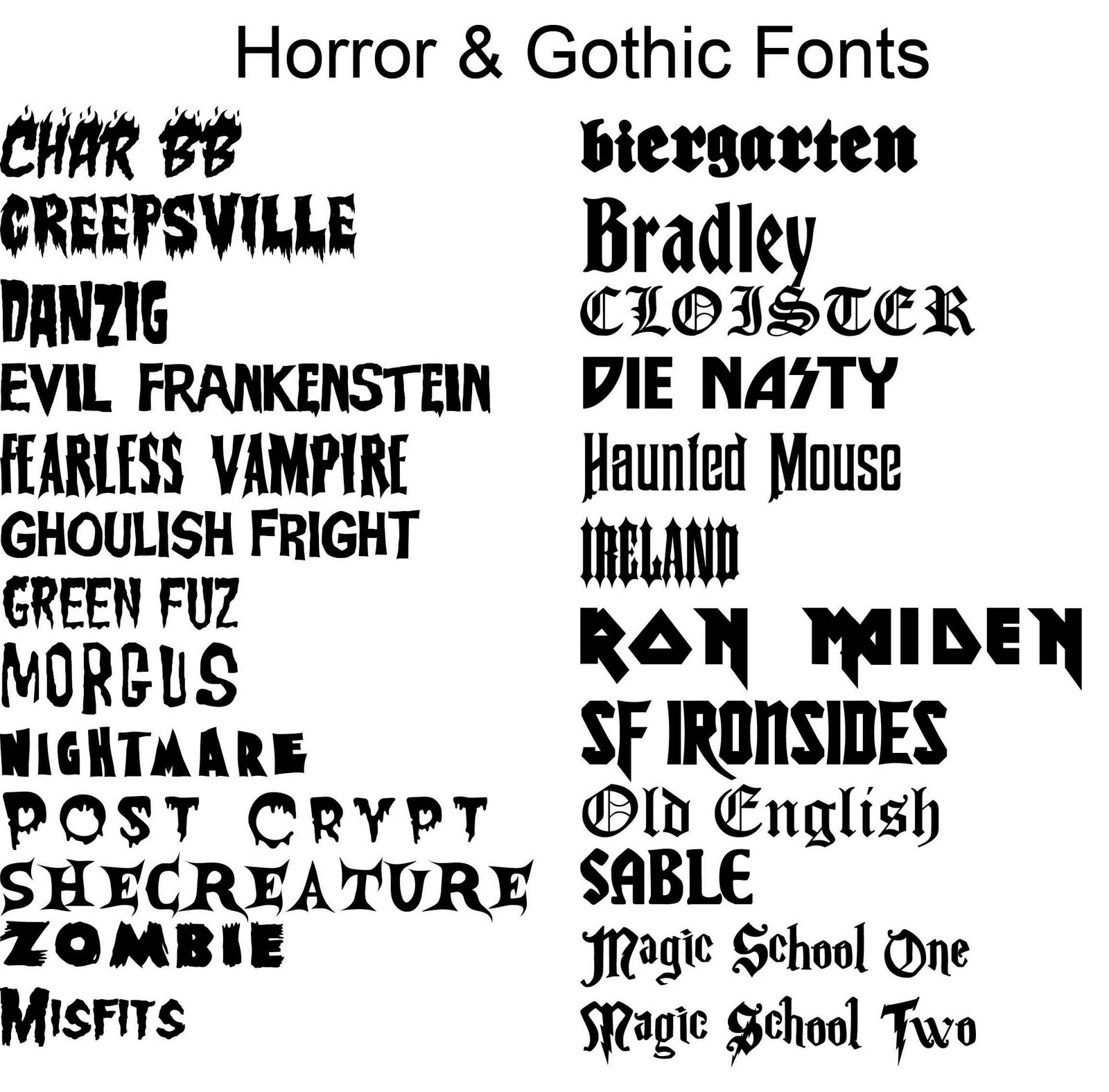
Broadly, fonts are categorized into serif, sans-serif, script, and display. Serif fonts, like Times New Roman and Georgia, feature small decorative strokes at the ends of each character, lending a traditional and elegant feel. Sans-serif fonts, such as Arial and Helvetica, lack these serifs, projecting a modern and clean aesthetic. Script fonts mimic handwriting, adding a touch of personality and flair, while display fonts are designed for large-format applications, often featuring bold and decorative styles.
The origin of many font names can be traced back to their creators, historical influences, or intended use. For example, Helvetica, a ubiquitous sans-serif font, takes its name from "Helvetia," the Latin name for Switzerland. Understanding the etymology of font names adds another layer of appreciation for their unique character.
Three key benefits of using appropriate fonts are enhanced readability, consistent brand identity, and improved aesthetic appeal. Choosing a font that is easy to read, especially for large blocks of text, is essential for effective communication. Using consistent fonts across different platforms strengthens brand recognition. Finally, aesthetically pleasing fonts enhance the overall visual appeal of a design, leaving a lasting positive impression.
Advantages and Disadvantages of Different Font Types
| Font Type | Advantages | Disadvantages |
|---|---|---|
| Serif | Readability (print), Traditional, Formal | Can appear dated in some digital contexts |
| Sans-serif | Modern, Clean, Readability (digital) | Can lack personality in some contexts |
| Script | Elegant, Personal, Decorative | Readability can be an issue for body text |
| Display | Bold, Eye-catching, Unique | Often unsuitable for body text |
Five best practices for implementing font types include: considering your target audience, maintaining consistency, prioritizing readability, pairing fonts effectively, and respecting licensing agreements.
Five real-world examples of font use include: Times New Roman in newspapers, Helvetica in corporate branding, Arial in website body text, Comic Sans in informal communications, and Lobster Two in display advertising.
Five challenges and solutions related to fonts include: licensing restrictions (solution: explore open-source alternatives), font pairing conflicts (solution: use font pairing resources), limited font availability (solution: subscribe to font services), readability issues (solution: choose fonts optimized for the medium), and accessibility concerns (solution: select fonts with good contrast and clear character shapes).
FAQs: What is a font? What is a typeface? What is the difference between serif and sans-serif? What are web-safe fonts? How do I choose the right font? What are font licenses? How do I install fonts? Where can I find free fonts?
Tips and Tricks: Experiment with font pairings. Use font preview tools. Consider the context of your design. Prioritize readability. Stay updated on font trends.
In conclusion, the world of font types and their names is a vast and fascinating landscape. Understanding the history, classifications, and practical applications of different fonts empowers you to make informed design choices. From enhancing readability to establishing a consistent brand identity, the right font can significantly impact the effectiveness of your communication. By following best practices, exploring different font families, and considering your target audience, you can unlock the true potential of typography and transform your text into a powerful visual statement. As you embark on your typographic journey, remember that the art of font selection is an ongoing process of learning and experimentation. Explore, refine, and discover the perfect fonts to elevate your designs and capture the essence of your message. Embrace the power of typography and watch your words come to life.
Spice up your desktop a guide to bart simpson pc backgrounds
The ultimate guide to stadium nachos in ann arbor
Po box 5332 sioux falls sd 57117


