Font Family Fetish: Why Your Website's Typography is EVERYTHING
Okay, let's talk fonts. Because seriously, have you ever landed on a website with typography so tragic it made you want to throw your laptop across the room? I have. It’s a digital fashion crime. Font selection isn't just about aesthetics, it's the backbone of your online presence. It’s the silent communicator, whispering (or screaming) your brand's personality before you even say a word. So, buckle up, font fanatics, because we’re about to embark on a typographic journey.
Picking the right font family for your website is like choosing the perfect pair of shoes. The wrong choice can completely ruin an otherwise flawless outfit (or, in this case, website). You wouldn't wear stilettos to a hiking trip, just like you wouldn’t use Comic Sans for a luxury brand. It’s all about context, people!
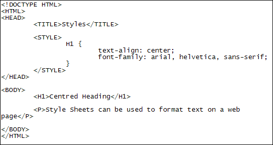
Now, the magic happens within the cascading style sheets (CSS) and HTML of your website. This is where you declare your font preferences. Think of HTML as the bare bones, the foundation, and CSS as the stylist, dressing things up with gorgeous fonts. The "font-family" property is your key weapon here. It lets you specify the typeface you want to use, creating a visual harmony that sings.
Historically, web designers were limited in their font choices. We were stuck with the system fonts installed on a user's computer. Imagine, a world without Google Fonts! Thankfully, the digital gods smiled upon us, and now we have a vast library of typefaces at our disposal. This explosion of options allows for unparalleled creativity and brand customization.
But with great power comes great responsibility. Choosing the wrong fonts can lead to readability issues, accessibility problems, and a general sense of design chaos. A website plastered with clashing fonts is like wearing too many patterns – it's just too much. The goal is to create a cohesive and visually appealing experience that keeps visitors engaged and coming back for more.
The font-family CSS property allows you to specify a list of fonts, separated by commas. This is essential because not all users have the same fonts installed. By providing alternatives, you ensure your text displays correctly across different browsers and devices. For example: `font-family: "Helvetica Neue", Helvetica, Arial, sans-serif;`
Benefits of Careful Font Selection
1. Enhanced Brand Identity: The right typeface can instantly communicate your brand's personality. A playful script for a children's clothing brand, a sleek sans-serif for a tech startup - it all adds up to a cohesive brand image.
2. Improved Readability: Clear, legible fonts are crucial for a positive user experience. Avoid overly decorative or cramped typefaces, especially for large blocks of text.
3. Accessibility for All: Consider users with visual impairments by choosing fonts with good contrast and avoiding overly thin or complex styles.
Action Plan for Font Selection
1. Define your brand: What is the personality of your brand? Is it modern, playful, sophisticated? 2. Research fonts: Explore font libraries like Google Fonts and Adobe Fonts. 3. Test and refine: Experiment with different font combinations and see how they look on different devices.
Advantages and Disadvantages of Utilizing Web Fonts
| Advantages | Disadvantages |
|---|---|
| Wider typographic choices | Potential performance impact (page load time) |
| Enhanced brand consistency | Licensing restrictions for some fonts |
| Improved readability and accessibility | Rendering inconsistencies across different browsers |
Best Practices
1. Limit the number of font families used.
2. Pair fonts that complement each other.
3. Optimize web font performance.
4. Ensure readability across different devices.
5. Prioritize accessibility.
FAQ
1. What is a font family? A font family is a set of related fonts that share common design characteristics.
2. How do I add fonts to my website? You can use the @font-face rule in CSS or link to external font libraries like Google Fonts.
3. What are some popular font pairings? Helvetica and Georgia, Montserrat and Lora, Open Sans and Playfair Display.
4. How do I avoid font rendering issues? Use a web-safe font stack and test across different browsers.
5. What is a web-safe font? A web-safe font is a font that is likely to be installed on most computers.
6. How can I optimize web font performance? Subset your fonts and use a Content Delivery Network (CDN).
7. Are there free font resources available? Yes, Google Fonts and DaFont are popular resources for free fonts.
8. How do I choose fonts for accessibility? Opt for fonts with clear letterforms and sufficient contrast.
In the vast digital landscape, typography reigns supreme. It's the silent ambassador of your brand, the voice that speaks volumes before a single word is uttered. By mastering the art of font selection, you unlock the power to create a captivating online experience that resonates with your audience. From readability and accessibility to brand consistency and visual appeal, the right font choices can elevate your website from drab to dazzling. So, embrace the power of the font family, and let your typography do the talking. Your website will thank you.
Discarding unwanted items a comprehensive guide
Marion county jail ocala fl inmates
Unlocking clarity mastering font size in windows 10


