Font Frenzy: Decoding the World of Typography
Ever scrolled through a website and felt inexplicably drawn in, or conversely, immediately clicked away? The secret ingredient might just be the font. Typography, the art and technique of arranging type, plays a crucial role in communication, branding, and user experience. It's more than just letters on a page; it's a powerful tool that can evoke emotions, establish credibility, and enhance readability.
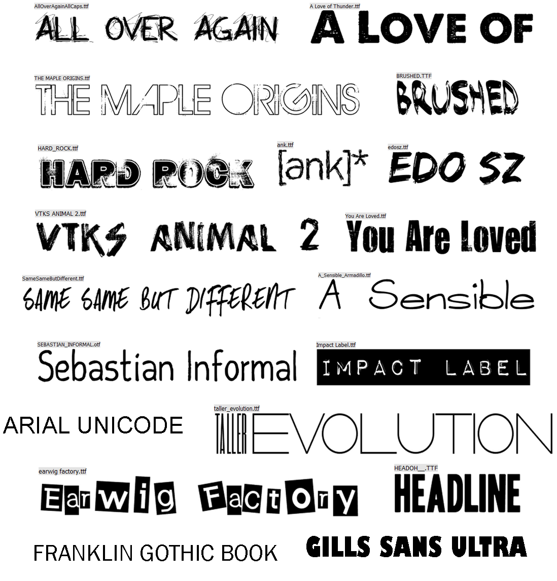
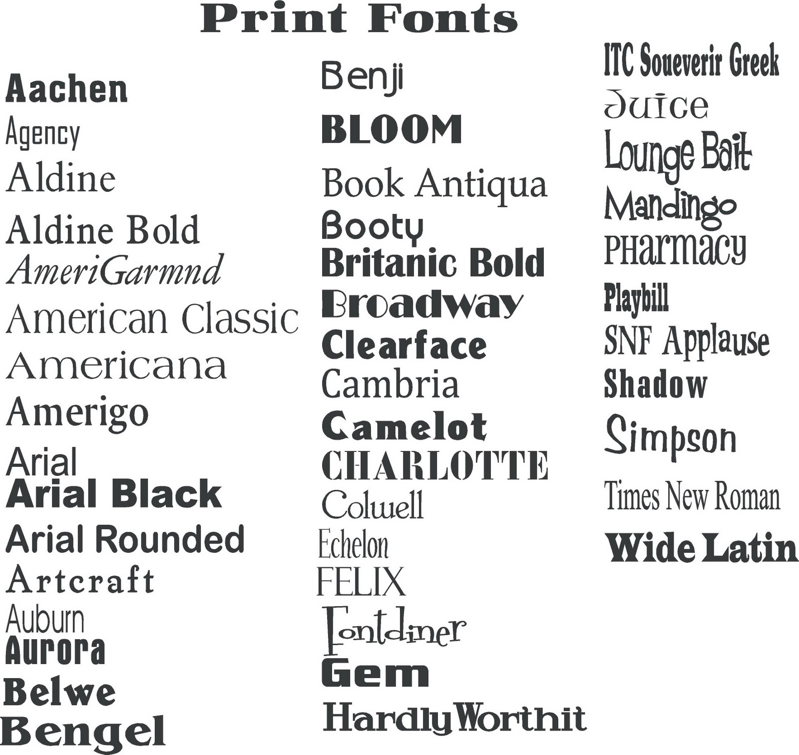
From the elegant curves of a script font to the clean lines of a sans-serif, the world of typography offers a vast array of choices. Understanding the nuances of different font families and their various styles can significantly impact how your message is perceived. This exploration into the diverse landscape of font styles aims to equip you with the knowledge to harness the power of typography.
The history of font styles is deeply intertwined with the evolution of written communication. Early forms of writing, like hieroglyphs and cuneiform, laid the foundation for the development of alphabets and eventually, the diverse range of fonts we see today. The invention of the printing press in the 15th century marked a turning point, leading to the standardization and proliferation of typefaces. From the classic elegance of Garamond, inspired by 16th-century Parisian type cutters, to the modern minimalism of Helvetica, each typeface carries its own history and cultural significance.
The importance of selecting appropriate font styles cannot be overstated. In the digital age, where content consumption is rapid and attention spans are short, typography plays a vital role in capturing and retaining audience interest. A well-chosen font can enhance readability, convey brand personality, and create a visually appealing experience. Conversely, a poorly chosen font can detract from the message, making it difficult to read or conveying an unintended tone.
One of the main issues related to font selection is achieving visual harmony and readability. Too many different font styles on a single page can create a chaotic and unprofessional look. Consistency and thoughtful pairing are key to effective typographic design. Additionally, considering accessibility is crucial. Certain fonts can be difficult for individuals with visual impairments to read, highlighting the importance of selecting fonts that are legible and accessible to all audiences.
Serif fonts, characterized by small decorative strokes at the ends of letterforms, evoke a sense of tradition and formality. Sans-serif fonts, lacking these serifs, project a more modern and minimalist aesthetic. Script fonts mimic handwriting, adding a touch of elegance or playfulness. Display fonts, often used for headlines or short bursts of text, are designed to be eye-catching and expressive. Choosing the right font family and style depends on the context and the desired message.
Benefits of utilizing a variety of appropriate font styles include enhanced readability, improved brand recognition, and increased user engagement. By selecting fonts that align with the content and target audience, designers can create a visually appealing and engaging experience that resonates with viewers.
Advantages and Disadvantages of Using Multiple Font Styles
| Advantages | Disadvantages |
|---|---|
| Visual Interest | Readability Issues |
| Emphasis and Hierarchy | Clashing Aesthetics |
| Brand Personality | Slow Loading Times (web) |
Best practices for implementing different font styles include limiting the number of fonts used, establishing a clear visual hierarchy, and ensuring consistency across all platforms. Pairing fonts effectively is crucial for creating a harmonious design. Consider the weight, size, and style of each font to ensure they complement each other and enhance readability.
Challenges in font selection include licensing restrictions, platform compatibility, and accessibility considerations. Solutions include using open-source fonts, web-safe fonts, and testing font rendering across different devices and browsers.
FAQs: What are the most common font families? What is the difference between serif and sans-serif fonts? How do I choose the right font for my website? What are web-safe fonts? How can I ensure my chosen fonts are accessible? What is kerning and tracking? How do I avoid font conflicts? What are some good resources for learning more about typography?
Tips and tricks: Use font pairing tools, experiment with different font combinations, and always test your typography on different devices. Consider the context and purpose of your content when selecting fonts.
In conclusion, the world of typography is vast and exciting. Understanding the nuances of different font styles empowers you to communicate effectively, create impactful designs, and enhance user experience. From the classic elegance of serif fonts to the modern simplicity of sans-serif, each typeface offers unique characteristics that can elevate your message and create a lasting impression. By carefully considering the principles of typography and implementing best practices, you can harness the power of font styles to achieve your communication goals. Explore the diverse world of fonts, experiment with different combinations, and discover the transformative impact of typography on your designs. Embrace the power of the font, and watch your words come alive.
Elevated living the allure of house design with terrace
Decoding the wv state employee pay schedule mystery
Decoding your kia soul an in depth parts guide


