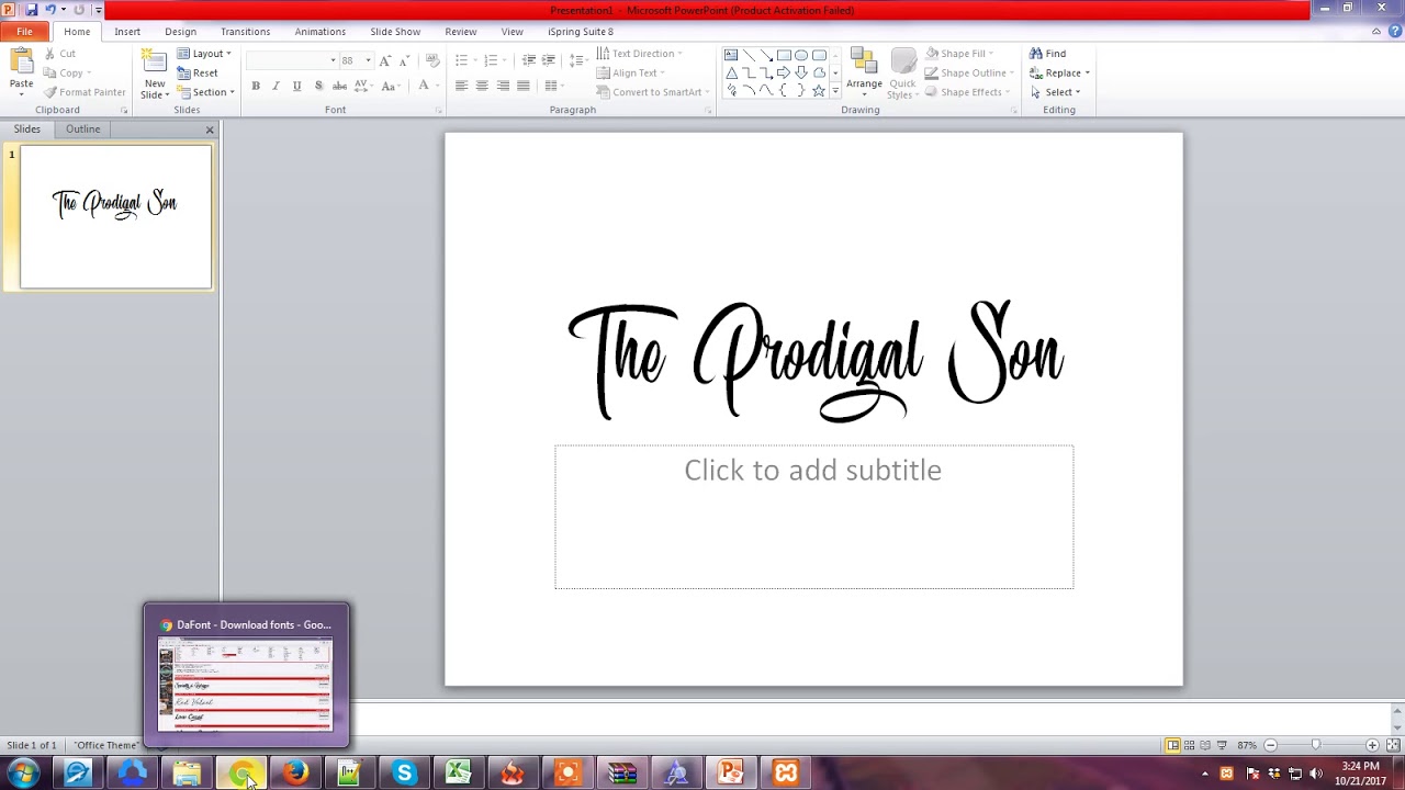
Rock Your Slides: Choosing the Perfect PowerPoint Font
Ever sat through a PowerPoint presentation where the font was so distracting, it was all you could focus on? Tiny, squished letters, elaborate cursive scripts that were impossible to decipher from the back of the room, or clashing styles that screamed "amateur hour"? Yeah, we’ve all been there. Choosing the right font can make or break your presentation. It’s the unsung hero of a killer slideshow, impacting readability, professionalism, and overall audience engagement.
Typography is more than just picking a typeface; it's about communicating effectively. The ideal PowerPoint font should be clear, legible, and visually appealing, reinforcing your message rather than distracting from it. In this guide, we'll dive deep into the world of PowerPoint fonts, exploring everything from timeless classics to modern choices, helping you select the perfect typeface to elevate your presentations to the next level.
While the concept of "best" is subjective, some general guidelines apply when selecting fonts for presentations. Consider the context of your presentation – a formal business proposal demands a different approach than a creative pitch. Your audience also plays a role; presentations aimed at older demographics might benefit from larger, more traditional fonts. The venue size also matters. A small conference room allows for more flexibility than a large auditorium where smaller fonts can easily get lost.
Historically, presentations relied heavily on default fonts like Times New Roman and Arial. While reliable, these choices can sometimes feel a bit stale. Over time, the design world evolved, introducing new fonts that offer a fresher, more contemporary feel. Choosing a modern, visually engaging font can signal innovation and keep your audience's attention focused on your message.
The biggest issue with font selection is often readability. A beautiful, stylized font might look great on your laptop, but become an illegible mess when projected onto a large screen. This can completely undermine your presentation, leaving your audience struggling to decipher your content. Poor font pairings also contribute to the problem. Too many different fonts, or fonts that clash stylistically, can create a visually cluttered and unprofessional presentation.
For impactful slides, opt for clean, easy-to-read fonts like Calibri, Arial, Helvetica, or Open Sans. For headers, consider slightly more stylized options like Montserrat or Raleway, ensuring they remain legible. Avoid overly decorative or script fonts, especially for body text.
Benefits of Choosing the Right Font:
1. Enhanced Readability: Clear fonts ensure your audience can easily absorb your message, improving comprehension and engagement.
2. Professionalism: Thoughtful font choices contribute to a polished and professional presentation, enhancing your credibility.
3. Visual Appeal: A visually engaging font can make your slides more dynamic and captivating, holding your audience's attention.
Action Plan:
1. Analyze your audience and content: Determine the appropriate tone and style based on your target audience and subject matter.
2. Select a primary font for body text: Choose a clean, legible font like Calibri or Arial.
3. Choose a complementary header font: Opt for a slightly more stylized font that pairs well with your body text.
4. Test your fonts: Project your slides to ensure readability at different distances.
Tips & Tricks:
Use font sizes that are easily visible from the back of the room (at least 24pt for body text, 36pt for headings). Maintain consistent font sizing and styling throughout your presentation for a cohesive look. Limit your font choices to a maximum of two or three.
Advantages and Disadvantages of Different Font Styles
| Font Style | Advantages | Disadvantages |
|---|---|---|
| Sans-serif (e.g., Arial, Calibri) | Clean, modern, highly legible on screens | Can appear too informal for certain presentations |
| Serif (e.g., Times New Roman, Georgia) | Traditional, professional, good for large blocks of text | Can appear dated or less impactful on screens |
| Decorative/Script | Eye-catching, adds personality | Often difficult to read, best used sparingly for titles |
FAQ:
1. What is the best font size for PowerPoint? Aim for at least 24pt for body text and 36pt for headings.
2. Should I use serif or sans-serif fonts? Sans-serif fonts are generally preferred for on-screen presentations.
3. How many fonts should I use in my presentation? Limit yourself to two or three fonts for a cohesive look.
4. Are decorative fonts suitable for PowerPoint? Use them sparingly, primarily for titles or short phrases.
5. Can I use custom fonts in PowerPoint? Yes, but ensure they are installed on the presentation computer.
6. What are some good font pairings for PowerPoint? Calibri and Montserrat, Arial and Raleway, Open Sans and Roboto.
7. How can I ensure my fonts are readable? Test your slides on a projector to assess readability from different distances.
8. Where can I find free fonts for my presentations? Websites like Google Fonts offer a wide selection of free, high-quality fonts.
Choosing the right font style for your PowerPoint presentations is crucial for creating engaging and effective slideshows. From ensuring readability and projecting professionalism to maintaining visual appeal and capturing your audience's attention, typography plays a significant role in the success of your communication. By following the tips and guidelines outlined in this article, you can avoid common pitfalls and create presentations that are both informative and visually compelling. Take the time to carefully select fonts that align with your message and target audience. Remember, clear communication is key, and choosing the perfect font is the first step toward achieving that goal. Invest in your presentations by mastering the art of typography, and watch your messages resonate with greater impact and leave a lasting impression on your audience. So, the next time you fire up PowerPoint, remember the power of the perfect font!
Cape town licence renewal go digital skip the queue
Navigating fes aragons academic services a students guide
Navigating the labyrinth inside fatahs political machine


